Colour - Part 1 - The Basics

Colour - from your digital file, to physical printed material, here's the ins and outs of our large format digitally printed colours and what you can expect. All correct terminology and jargon has been ignored for Part 1 of this series.
Types Of Colour
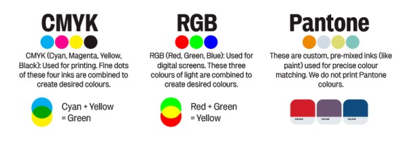
The colour in your file has to be formulated in some way. Common methods are using CMYK, RGB or Pantone.
CMYK stands for Cyan, Magenta, Yellow and Black. They are the colours we use for printing. (Cyan + Yellow = Green)
RGB stands for Red, Green and Blue. They are the colours used in monitors and displays. (Red + Green = Yellow)
Pantone is a colour system much like paint. They're actual ink colours. We do not print with Pantone colours. When a Pantone colour is specified, we use a combination of our CMYK inks to do a best match.

Best Practice
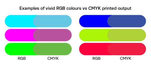
We recommend making your files using CMYK as it is the most predictable and consistent method. It may present some limitations, but in general is a predictable way of producing and managing your colours. If you use RGB, bear in mind some of those super vibrant colours will lose their punch, we simply cannot match them, and the same goes for some Pantone colours too.

Accuracy and Expectations
We spend literally hours and hours implementing and managing colour controls. This does not mean every job will be 100% colour perfect. Important stuff to know...
• Bang on, perfect, consistent colour matches can happen, but on any given day there may be a slight variance in output. We always aim for the most accurate match.
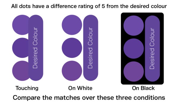
• There is a formula for defining an acceptable colour match. It is the measured difference between two colours (called Delta E), and a value of 3 to 5 is considered an acceptable match, with 0 being an exact match.
• Sometimes it is not possible to mix an acceptable colour match using our printing inks. In these cases the nearest match is specified.
• A colour can appear different depending on where it is placed in a design. It may look different on a dark background compared to a light background.
• Lighting conditions can change your perception of colour - a sunny day has a very different colour to a cloudy day. LED lighting can be warm or cool.
• Sometimes, exactly identical colours can appear to match in one light, but not under another. This is common and is called metamerism.

What happens when you print my file?
Your file is first manually checked for integrity. We aim to discover any issues before they are printed. After these checks, your file is processed by high end software that looks at your file and then reformulates it to ensure the colour integrity is preserved and output correctly at the printer. It is pretty complicated and is covered in parts 2 and 3 of this series.
Click here for Part 2 - Colour profiles, gamuts and mapping.
