Tag: quality control
Colour - Part 2 - Profiles and Gamuts

Colour - Part 2, dives into the relationship between colour modes, colour profiles and how much influence a colour gamut has on the printed output. Here we dive a bit deeper into the technical side of things.
Colour - Part 1 - The Basics

Colour - from your digital file, to physical printed material, here's the ins and outs of our large format digitally printed colours and what you can expect. All correct terminology and jargon has been ignored for Part 1 of this series.
Pixels At A Distance
This is always a hot topic in digital print... just how many pixels does an image need to get a good result? Rather than let you rely on taking our word for it, we've run a series of prints so you can see for yourself. We have done a range of prints from 10ppi to 300ppi to demonstrate exactly what a print at a specific resolution will look like. The results are quite interesting.
CMYK - No Such Colour

We are so far into the digital age yet there is still a bit of confusion about CMYK (and RGB) colour models. I'll do an overview of the CMYK colour model and the affect on digital print it has. The biggest misconception is that a colour specified as CMYK percentages alone represents an actual colour. It would be wrong to accuse a digital printer for producing incorrect colour if the only thing you provided was a combination of CMYK percentages such as those seen in corporate identity manuals. Read on to find out why...
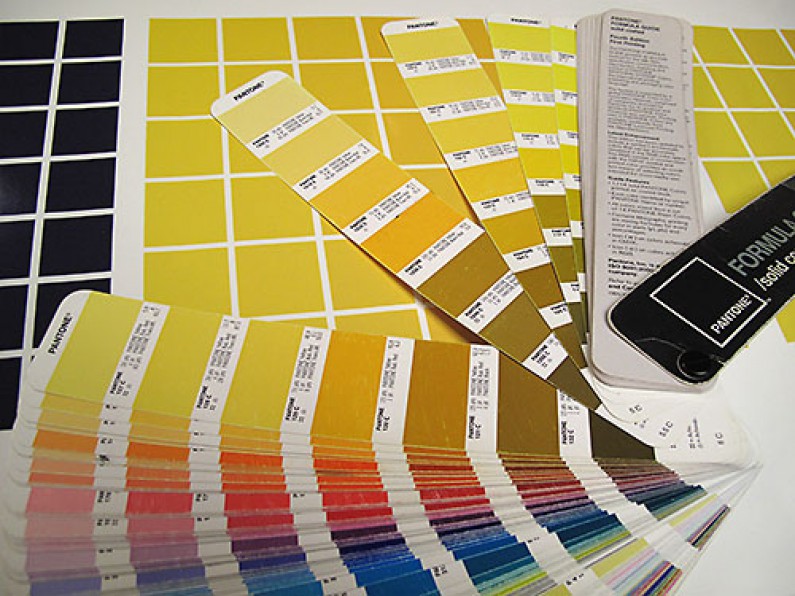
True Colours

In previous articles, I covered how we control colour with software and hardware using design programs and the printers. There is another important piece of hardware too. It's a colour matching booth. Not a weird device that you climb inside and lock the door, but rather a station that has special fluorescent tubes that illuminate vertically mounted prints and proofs from above. The big problem to overcome with manual hardcopy matching of colour is the lighting conditions. There are so many different conditions, fluoresecent warm to cool tubes, halogen, daylight sunny and cloudy, incadescent blubs and now led lighting which all emit different colour. There is no easy solution but a good start is an industry standard, which just happens to be D50 or more commonly known as daylight.
Adgraphix Wins International Award

We were the only Australasian competitor to gain a placing in the inaugural HP Digital Print Awards 2010 (Asia Pacific & Japan). The awards were open to owners of HP Scitex industrial printers in the Asia Pacific and Japan regions. This makes for a massive customer base eligible to enter. There were 5 categories with gold, silver and bronze being awarded in each. We entered our bronze winning Glassons Westfield Riccarton entry in the 'Interior Advertising' category.
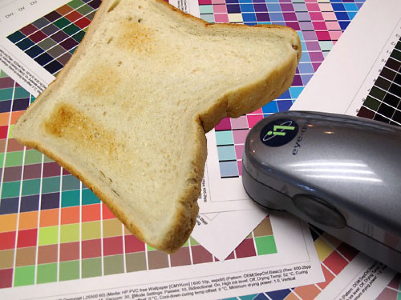
Burning The Toast

Matching colours correctly; it is a process that happens behind the scenes. You might not realise how important it is and why we take it so seriously. A number of years ago I read an article which is a great way to describe why colour management so important. It's all about making toast!
You Just Push Print Don't You?

It's true, the easiest thing about digital printing is buying (if the bank likes you) the machine. Yes, the printers are automated, but they require quite a lot of user interaction to make the difference between a good print and a not so good print. Taking a closer look at the not so good prints, it comes down to a few important details which require additional skills, than just sending files to a machine. Here is a small snapshot of some baddies we avoid in the background.